The Office: Does it really get better after season one?

I have been told on numerous occasions by multiple people that if I have not watched the office then I am not living the life. I even tried to watch it once but couldn’t get past the first episode. I did not find it as funny and interesting as I was told it was. Recently, again one of my really close friends watched the series and they suggested it to me. When I told them that I had already tried watching the show, but didn’t find it funny, they told me the first season is not as good as the following ones, but that it was worth it to make it through the first season.
This revelation by my friend about the first season not being the best one, got me thinking that this was a very good idea for a joke: you tell someone a very bad TV series starts getting awesome after a few seasons that you need to watch in order to know the characters… therefore forcing them to lose their time and sanity in front of the screen, ah!
After discussing this fact with some other friends who had already seen the show, I found that they have the same feeling about the first season. This got me wondering whether this was the general belief among the people who have watched this show. To answer this question, I downloaded IMDB ratings for the show!
To get the IMDB rating of the show, I used the BeautifulSoup package in python to scrape the rating from the IMDB page of The Office. I followed this wonderful DataQuest tutorial by Alex Olteanu that explains, in-depth, how to scrape over 2000 movies from IMDb, and modified it to scrape TV series episode ratings.
The thing to keep in mind while web scraping is to understand the basic HTML structure of a single page and identify the URL structure. I found the same tutorial quite handy in understanding these.
You can find the code to extract the data on my github here. Once I had the data extracted, I made the dataframe out of it and did some general cleaning and wrangling of the data.
To finally answer the question, I decided to make a beeswarm plot.Using the beeswarm plot, it is quite easy to see how the data is distributed. I tried making the plot in python, but due to my novice python skills, I wasn’t able to modify the plot to my liking. I decided to take the dataset into R and create the plot there using the ggbeeswarm package.
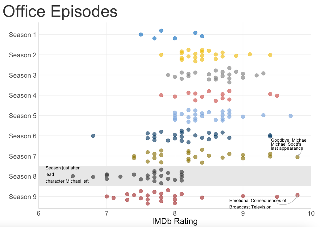
Looking at the plot, we can say that the first season, with only 6 episodes was slightly less enjoyed! Further, we can see that season 8 is the least enjoyed season of the show. Now that I know the show actually gets better after season one but it gets bad in the penultimate season. Will I watch it? I don’t know! But I am quite happy that it was so simple to answer this question.
Side Note: I also did some simple EDA on the dataset, which along with the code for creating the plot can be found here.
See you soon for a new post!
Thanks for reading! You can always email me to chat about this post - or anything else.