WHERE TO LIVE IN INDIA: BASED ON YOUR CLIMATE PREFERENCE
While surfing on the internet I recently landed on Maëlle Salmon’s blog which had started a trend on twitter to find the ideal cities to live in different parts of world, based on your climate preference. I thought why not do something like this for India. Maëlle Salmon’s blog post was originally inspired by xkcd comic. So, let’s find where you should live in India!
DATASET
To get the weather data for cities in India, I used Maëlle Salmon’s library package “riem”.The riem package allows you to access the weather data from all over the world collected at airport weather stations. My main reasons for using this package was:
- It is very convenient!
- To get actual data from Indian Meteorology department, you have to fill a request form, and then they will send you the data.
I didn’t know what the code was to access weather data of Indian airports, hence I used riem_networks command to do it.
data <- riem_networks
library(dplyr)
data %>% filter(name == "India ASOS")
Running this we find that code for India is “IN__ASOS”. To see the different airports in India we use riem_stations command. Using the command, we see that there are 96 airports in the Indian network, I am sure that India has more airports but for the sake of this project we will only consider these. Also, from the id column we see that airports are coded in the ICAOstandard rather than the IATA standard.
I, personally, did not know there are two types of codes for airport, and the one that I and most probably you use while booking tickets is IATA(New Delhi as DEL, Mumbai as BOM).
To get the city data with ICAO standard, I used this page, wherein I simply copied ICAO, name, and municipality column and pasted it in an excel sheet. I then loaded this sheet into R using read_csv function from readr library.
Now that we have city data, we want to acquire weather data. We use the riem package for this. We use the same code from Maëlle Salmon’s original blogpost where she uses map_df(), from purrr library, to apply riem_measures() on each airport code with the output being a lovely data frame! I checked this Wikipedia page, to see how summer and winter are defined by the India Meteorological Department. Basically, this is how they define the seasons
-Winter, occurring from December to February
-Summer lasts from March to May
library(purrr)
summer_weather <- map_df(indian_airports$ICAO, riem_measures, date_start = "2019-03-01", date_end = "2019-05-31")
View(summer_weather)
winter_weather <- map_df(indian_airports$ICAO, riem_measures, date_start = "2018-12-01", date_end = "2019-02-28")
View(winter_weather)
The result is two gigantic datasets of around 175,180 observations each along with 31 variables ranging from dew point temperature, wind direction in degrees from north, relative humidity, and many more! Please load the riem package before using riem_measure. Also, while getting the winter data don’t forget to put previous year in date_start, or else you will get error!
DATA MANIPULATION
All the temperatures in data are stored in Fahrenheit, hence we convert it into Celsius using the convert_temperature() function in the weathermetrics package, and mutate from dplyr. Here the variable tmpf signifies air temperature in Fahrenheit, dwpf signifies dew point temperature in Fahrenheit. You find the meaning of different variables from this website.
library(weathermetrics)
summer_weather <- summer_weather %>
mutate(tmpc=convert_temperature(tmpf,
old_metric = "f", new_metric="c"),
dwpc = convert_temperature(dwpf, old_metric = "f", new_metric = "c"))
winter_weather <- winter_weather %>%
mutate(tmpc = convert_temperature(tmpf,
old_metric = "f", new_metric = "c"))
In the xkcd comic, the author uses Humidex(how hot the weather feels to the average person, by combining the effect of heat and humidity) to define summer values, and average temperature for winter. We can then calculate the humidex with the calcHumx() function from the comf package! The formula for the same is:

The interpretation of the humidex is as follows: ->20–29: Little to no discomfort
->30–39: Some discomfort
->40–45: Great discomfort (avoid exertion)
->45+ : Dangerous (possibility of heat stroke)
library(comf)
summer_weather <- summer_weather %>%
mutate(humidex = calcHumx(ta = tmpc, rh = relh))
Now, we use group_by() and summarize() function from dplyr package to make a new data frame with humidex for summer, and average temperature for winter, for every airport.
summer_data <- summer_weather %>%
group_by(station) %>%
summarize(summer_humidex = mean(humidex, na.rm =TRUE))
winter_data <- winter_weather %>%
group_by(station) %>%
summarize(winter_avg_temp = mean(tmpc, na.rm = TRUE))
DATA FOR PLOTTING
We are getting close to the final goal. The penultimate step is to prepare the data for plotting. We join summer and winter data together using the left_join() function from dplyr package. Then, we join with the indian_aiprorts data set to add in city names to airport code data set, combine them by the airport ICAO code.
And with this our data is ready!
FINALLY, PLOTTING!
We use ggplot2 package to make the graph. We also use ggrepel pacakage to repel overlapping text labels.
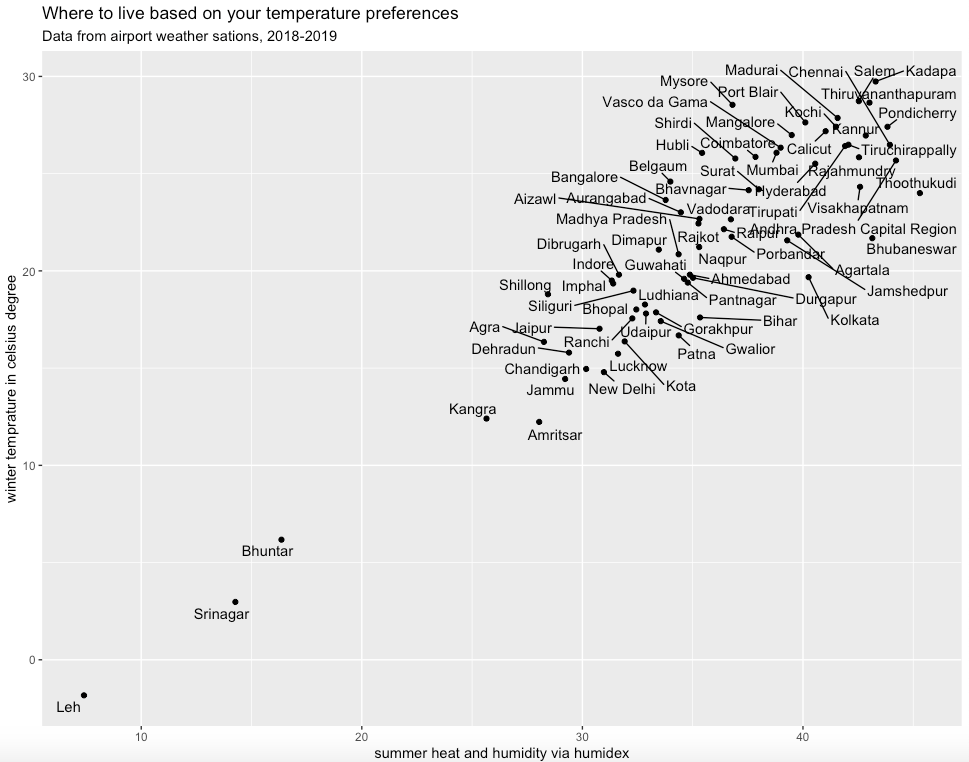
climate_india %>%
ggplot(aes(summer_humidex, winter_avg_temp))+geom_point()+
ggtitle("Where to live based on your temperature preferences", subtitle="Data from airport weather stations, 2018-2019")+
geom_text_repel(aes(label=Municipality), max.iter=50000)+
xlab("summer heat and humidity via humidex")+
ylab("winter temperature in celsius degree")
Since this post was inspired by xkcd, it only made sense to convert the text in this into xkcd font.
climate_india %>%
ggplot(aes(summer_humidex, winter_avg_temp))+
geom_point()+
ggtitle("Where to live based on your temperature preferences", subtitle="Data from airport weather stations, 2018-2019")+
geom_text_repel(aes(label=Municipality), max.iter=50000)+
xlab("summer heat and humidity via humidex")+
ylab("winter temperature in celsius degree")+
theme(text = element_text(size =16, family = "xkcd"))
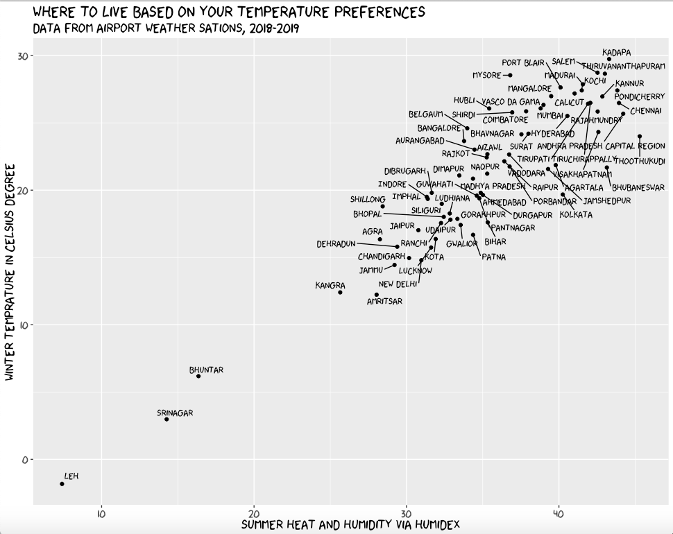
I didn’t use xkcd theme, because I liked the background.
Also, some points to note:
1.Some of the cities like New Delhi should be more on the right on x-axis, based on personal experience(it is much more humid and hot there!). I think the values came out little less because we used weather data from airport, and not actual data.
2.Pune is missing in the plot, because it was not present in riem data set. See, if you can find anymore cities that are missing
3.I have only considered data for a year, but considering more than that would result in a more accurate graph. Maybe, it might solve the problem mentioned in point number one.
So, considering the graph where would you choose to live?
See you soon for a new post!
Thanks for reading! You can always email me to chat about this post - or anything else.